The importance of using color alchemy in Branding? When most people think about logo design, the focus often falls on shapes, fonts, or simplicity. While these elements are important, the true power of a logo lies in its colors, not as mere aesthetic choices, but as strategic tools that influence perception, emotion, and behavior.
Imagine a brand whose colors speak to its audience before any text is read or any product is seen. The red sparks excitement, the blue builds trust, and the green reassures the conscious consumer. In this modern approach, colors become psychological instruments that shape brand identity, drive engagement, and even influence purchasing decisions.
In this guide, we’ll explore a fresh perspective on color psychology in logos, framing colors as strategic forces that can define a brand’s personality, enhance its narrative, and forge lasting emotional connections with its audience.
Colors as Strategic Forces: Beyond Traditional Symbolism
Traditional discussions of logo colors often focus on general meanings: red for energy, blue for trust, green for nature. While not inaccurate, these interpretations scratch only the surface. Advanced branding sees colors as cognitive triggers that influence decision-making and perception at a subconscious level.
- Red is not just energetic; it activates the brain’s urgency circuits, making audiences feel compelled to act, perfect for call-to-action-driven campaigns.
- Blue does more than convey trust—it enhances memory retention, creating long-term associations of reliability and stability with a brand.
- Green extends beyond growth symbolism; it soothes the mind and fosters a sense of balance, ideal for sustainable and wellness-focused brands.
- Yellow and Orange capture attention and evoke cheerfulness, not simply through brightness but by stimulating neural reward pathways that enhance engagement.
- Purple and Black convey luxury and depth, influencing perceived value and positioning a brand as premium or aspirational.
By understanding colors as psychological tools, businesses can craft strategic visual messaging that resonates deeply with audiences.
Building a Brand Personality Through Colors
Modern branding treats color as a character trait rather than a mere design element. Each hue can represent a distinct aspect of the brand’s personality, creating a multidimensional identity:
- Primary Color: Reflects the brand’s core personality. For example, a fintech startup might choose blue for trustworthiness, while a fitness brand selects red for energy.
- Secondary Colors: Support the narrative, adding nuance and flexibility to campaigns. These shades can adapt depending on context or messaging.
- Emotional Accent Colors: Specifically chosen to evoke desired feelings—excitement, calm, curiosity, or confidence—in targeted moments across marketing channels.
This approach transforms the logo from a static symbol into a storytelling device, where every color communicates a deliberate psychological message.
Color as a Narrative Tool in Digital Experiences
In today’s digital-first world, logos and color schemes do more than look appealing—they shape the entire user experience:
- Websites and Apps: Color impacts user behavior, from navigation patterns to dwell time, and can subtly guide users toward desired actions.
- Digital Advertising: Color influences attention, recall, and click-through rates, especially when paired with optimized messaging and visual hierarchy.
- Cross-Platform Consistency: Maintaining a coherent color palette across all touchpoints strengthens brand recognition and builds a seamless, emotionally resonant brand journey.
When colors are integrated into a brand’s digital ecosystem strategically, every user interaction becomes an opportunity to reinforce the brand identity and values.
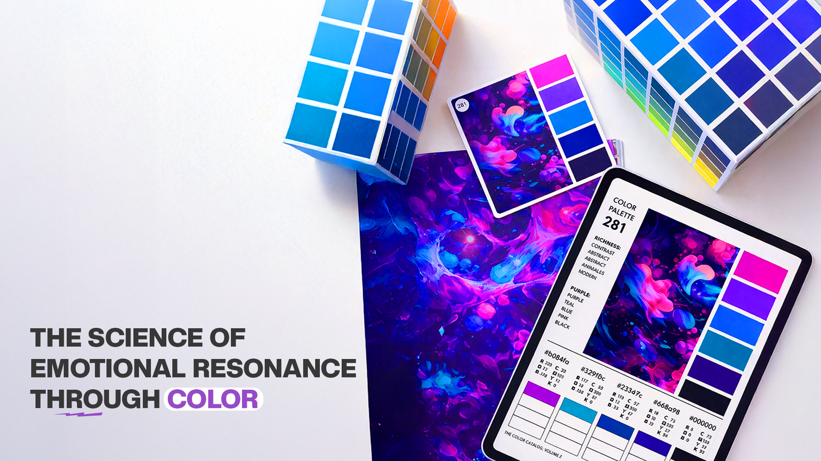
The Science of Emotional Resonance Through Colors
Colors are emotional triggers; they evoke feelings even before cognitive processing occurs. Here’s how brands can leverage this scientifically:
- Red activates excitement and urgency, enhancing immediate engagement. Brands using red in e-commerce or call-to-action buttons often see higher conversion rates.
- Blue engages the brain’s trust centers, fostering loyalty. Financial institutions and tech brands often use blue to solidify credibility and reduce perceived risk.
- Green induces calmness and harmony, promoting sustainable behaviors. Brands in wellness, organic products, or eco-conscious industries benefit from this calming influence.
- Yellow and Orange spark creativity and joy, ideal for campaigns targeting younger demographics or entertainment-focused audiences.
- Purple stimulates imagination and premium perception, effectively differentiating luxury or niche brands.
- Black & White convey timelessness, elegance, and minimalism, appealing to sophisticated and high-end consumer bases.
By pairing these emotional triggers with strategic messaging, brands can create compelling, psychologically aligned marketing experiences.
Innovative Approaches to Color Combinations
The true mastery of color in branding comes from intelligent combinations, not single hues. Innovative strategies include:
- Gradient and Dynamic Palettes: Gradients suggest movement, evolution, and adaptability, perfect for tech or lifestyle brands positioning themselves as modern and progressive.
- Contextual Adaptation: Some brands vary their logo colors depending on platform, audience segment, or even time of day, creating a dynamic visual experience.
- Unexpected Pairings: Using unconventional color mixes can generate surprise, memorability, and emotional impact, setting a brand apart in crowded markets.
Through experimentation and data-driven testing, brands can refine their color strategies for maximum recognition, engagement, and emotional resonance.
Color and Storytelling: Beyond the Visual
Colors should not be considered in isolation. They work best when woven into the brand’s narrative:
- Red can represent the brand’s energetic drive in campaigns, symbolizing boldness and courage.
- Blue communicates reliability in customer support and professional interactions, reinforcing brand promises.
- Green signals the brand’s commitment to sustainability in social responsibility stories.
- Yellow accents highlight moments of delight and positive customer experiences.
By integrating color into storytelling, every touchpoint from emails to ads to packaging becomes a narrative cue, reinforcing brand personality and guiding consumer perception.
Measuring the Impact of Colors
A color strategy is not complete without measurement and optimization. Brands can track:
- Conversion Rates: Do CTA buttons in red outperform those in blue?
- Engagement Metrics: How do audience interactions vary with different color schemes across social media campaigns?
- Brand Recall Studies: Which color palettes leave the strongest impression on customers?
These insights allow brands to fine-tune their palettes, making every color choice deliberate, impactful, and aligned with business objectives.
Moving Beyond Traditional Thinking
The modern perspective on logo colors treats them as strategic tools that extend influence, shape perception, and evoke emotion. This approach shifts focus from purely aesthetic decisions to psychologically grounded branding strategies:
- Colors are instruments of behavioral influence, guiding customer decisions subtly.
- A strategic color palette reinforces brand coherence across channels, increasing recall and trust.
- When paired with storytelling and messaging, colors become key drivers of emotional engagement and loyalty.
This is color alchemy, transforming visual elements into psychological and strategic assets that power brand growth.
Conclusion: Colors as a Strategic Superpower
Logo colors are far more than decoration; they are psychological levers, narrative devices, and strategic tools that influence perception, decision-making, and brand loyalty. By approaching color with intention and innovation:
- Brands communicate values, personality, and vision without a single word.
- Emotional resonance is engineered across touchpoints, from digital ads to packaging.
- Recognition and recall become predictable outcomes of a thoughtfully crafted color strategy.
In the modern marketing landscape, mastering color psychology is not optional; it is a strategic superpower that can elevate a brand above competitors and embed it deeply in the minds and hearts of its audience.
At Asia Advertising, we help brands harness the psychological power of color, crafting logo palettes and visual identities that are strategically aligned, emotionally resonant, and designed for measurable impact. Every color choice tells a story, shapes perception, and drives engagement, turning logos into unforgettable brand experiences.